Designing apps for health and wellness
By Heather Fox
As designers, we strive to make things aesthetically pleasing. Seems simple enough. But the role of the designer has evolved tremendously.
We’re responsible for so much more than making something look more appealing. We don’t design just to boost sales or for beauty itself. We design as problem-solvers. We design with understanding.
We design with human benefit motivating the choices we make.
When we design for health and wellness, we want what we create to be usable, relevant, and to improve the lives of others. We are responsible for creating a bridge between disciplines, and then making it accessible to all. Our choices as designers can either enhance or unfortunately, defeat the purposes of something that was meant to be helpful.
For example, if we were creating an app for people with insomnia to use near bedtime we certainly wouldn’t want to inadvertently use a stimulating color. How do we choose the colors we use? We could go with our own feelings about what colors would promote sleep. We are the designers, right? We understand what is stimulating and what is tranquil. Or we could go even further and see if there is any research that could be useful as we make our decisions. Let’s take a look.
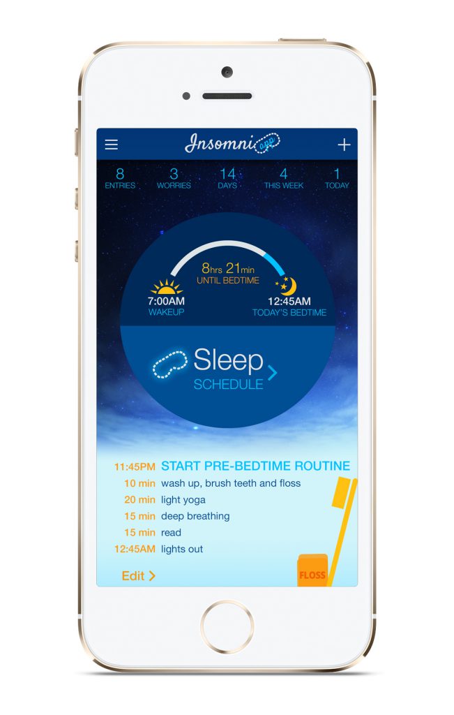
Scientists are familiar with how different kinds of light affect circadian rhythms (the internal clock in mammals). A recently published study found that the changes in color, not just changes in light, are necessary to regulate this internal clock. This study’s authors believe that their data “reveal a new sensory mechanism for estimating time of day that should be available to all mammals capable of chromatic vision, including humans”. Looks like a sunset is more than just beautiful!
When a hotel chain wanted to decide what color to use in their rooms to promote a better night’s rest they surveyed 2,000 households and came up with a clear winner—blue, with warm tones like certain shades of yellow coming in second place. And what about images we choose? Brainstorming sessions? Sure. But we can dig a little deeper. Sleep experts discourage clock-watching and even suggest turning the clock’s face away from us when we want to fall asleep. That’s a strong hint about some imagery we’d want to avoid using!
Our responsibilities as designers continue to grow. We understand just how much design has evolved to better reflect and influence the human experience. By leveraging science and empathy to understand the mind and body we can design in a way that truly touches humans to achieve a positive outcome in health and wellness.

